Home / qcif
QCIF provides high-performance services, infrastructure and support to achieve excellence in computation and data-driven collaborative research and its application in industry.
Services
Branding
Publications
Website
Style Guide
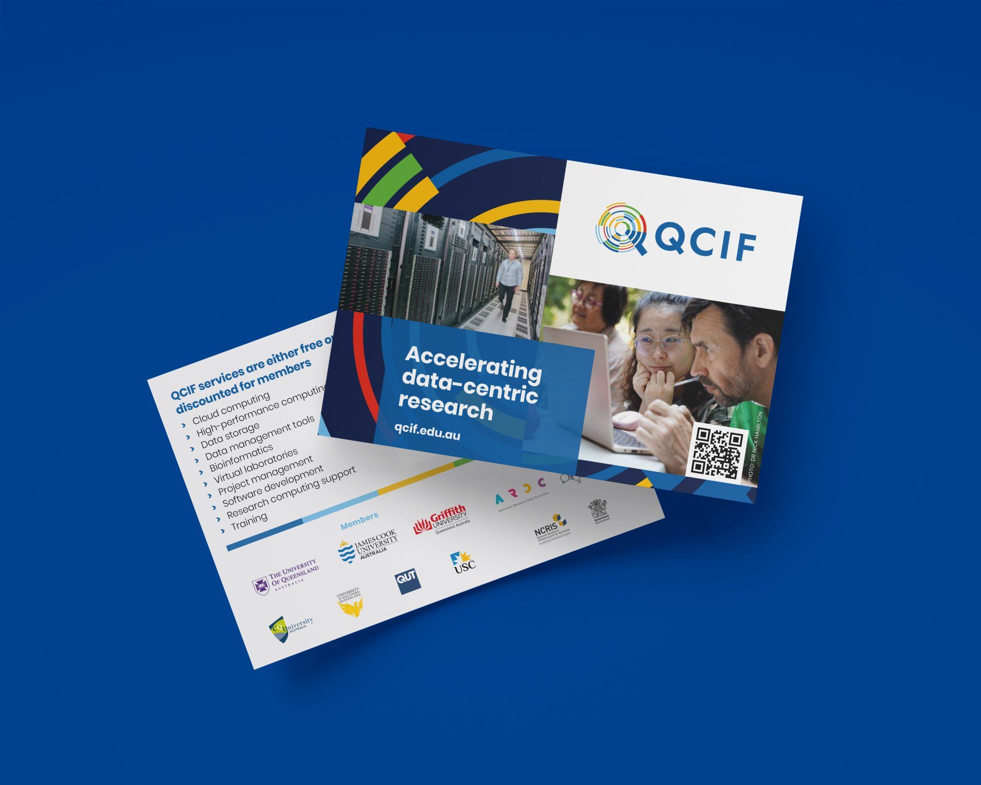
QCIF
Service changes required a new brand
QCIF provides high-performance services, infrastructure and support to achieve excellence in computation and data-driven collaborative research and its application in industry.
With a 'Queensland-centric' logo, it was time for a refresh to look more like a national service to increase its audience and customer engagement.
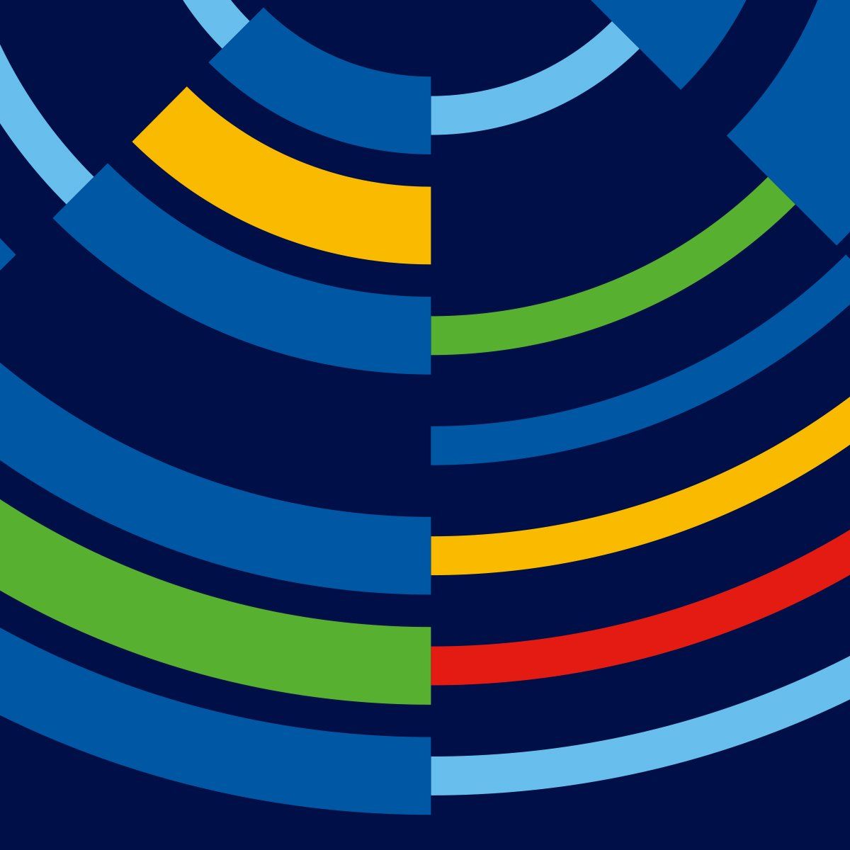
When designing the QCIF logo, we applied our 'bringing to life' philosophy. This philosophy allows any logo we create to be animated or realised in a 3D application such as signage. The 'Q' logo meets all our 'bringing to life' criteria, with the dynamic revolving concentric circles, different line thicknesses, and multiple brand colours linked to each sub-brand.
The 'Q' logo is also a stylised magnifying glass or search icon that reveals various data types portrayed by the different colours and line thicknesses.
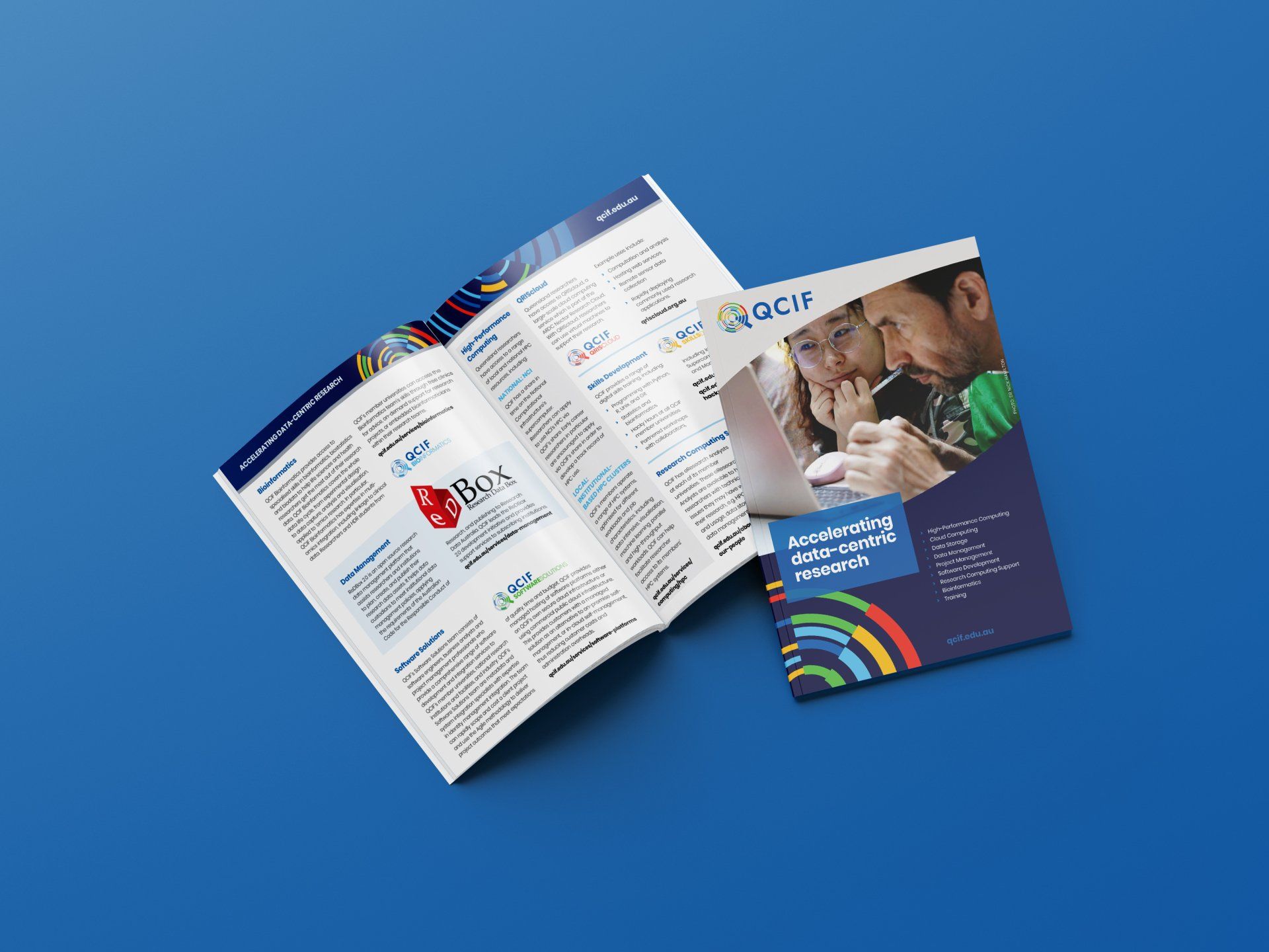
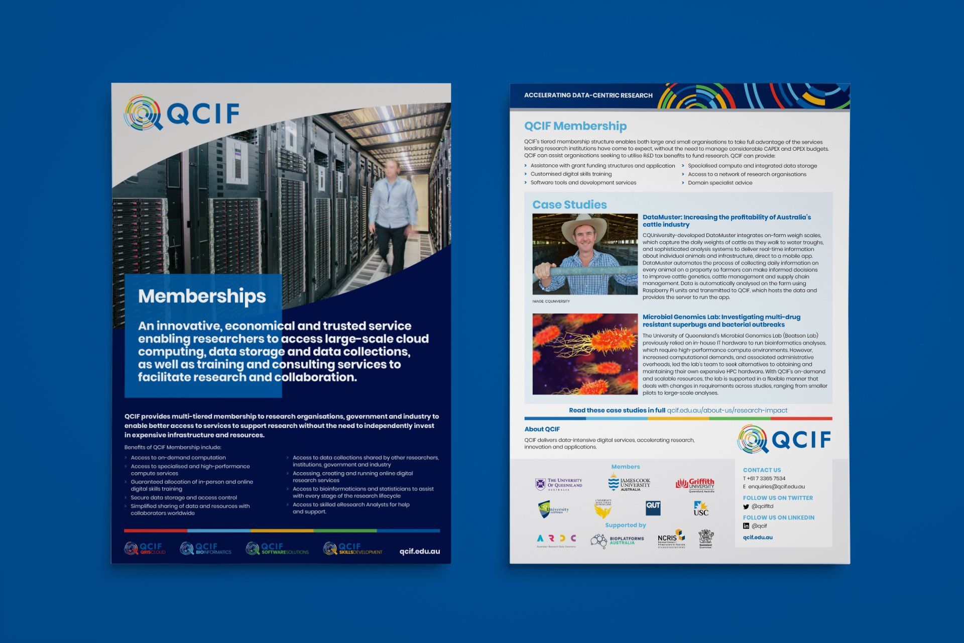
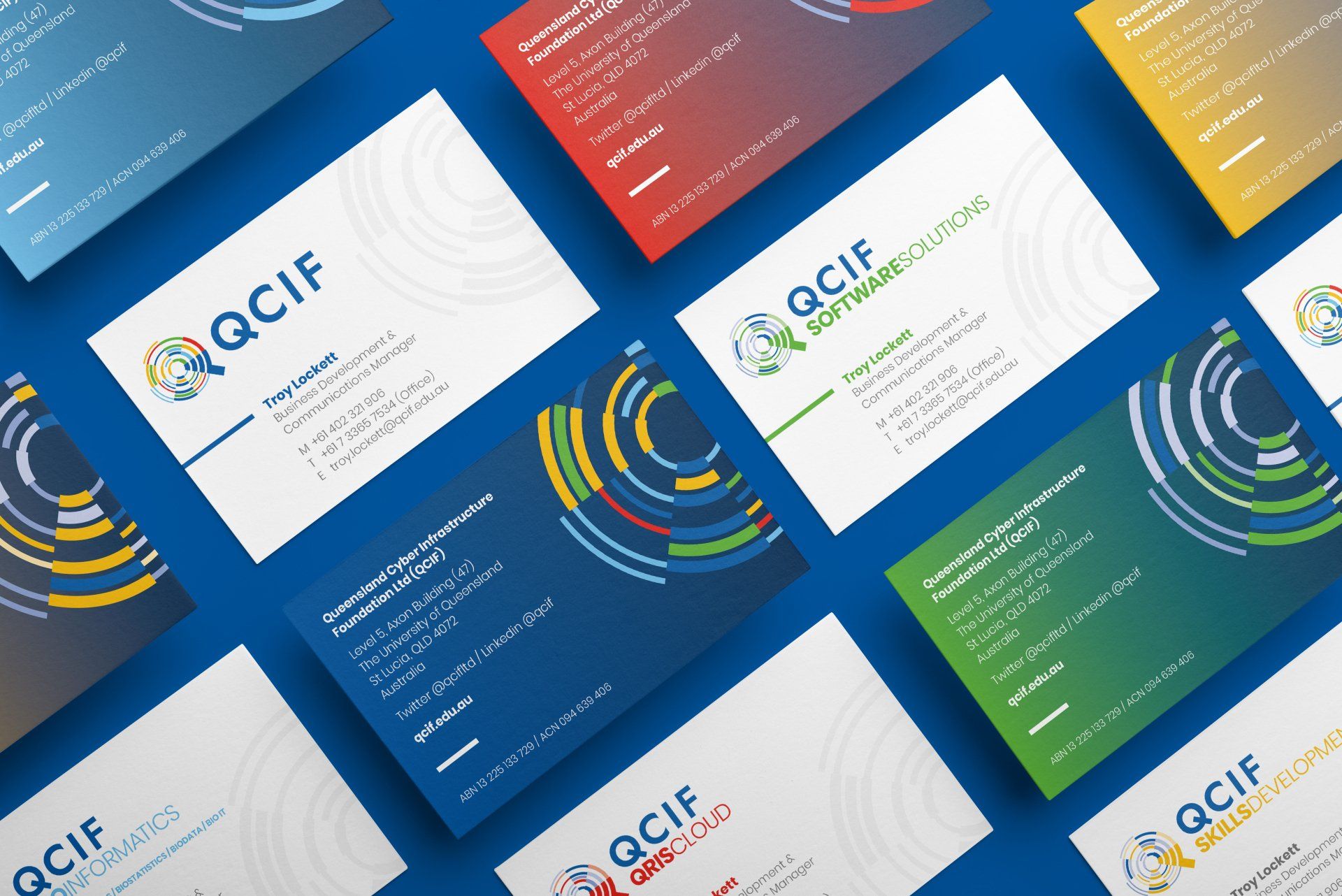
We realigned all QCIF sub-brands to sit under the leading QCIF brand. Using colours from the primary logo to define each service, consistent fonts and structure, they all display individual identities.
The 'Q' graphic can be deconstructed and cropped, supported by a strong colour palette and font family; multiple layout options can be created and used consistently throughout all the designs to build brand recognition.
With all branding refresh projects, we are excited to see them reinvigorate an organisation and, more importantly, that what we create is functional and easy to use assets to maintain the branding throughout its communication activities.
Branding continually evolves. With a strong branding foundation, QCIF can build continually to improve engagement for all its marketing activities.
01 /
Brand Identity
Due to QCIF's structure and services changes, we sought to rebrand and bring our logo and marketing collateral into the 21st Century. We've worked with AKD for more than five years and have always been impressed with their service, design concepts and professionalism. We trust their work and ability to meet deadlines. We now have a new logo we can be proud of and a suite of attractive and informative marketing collateral that will undoubtedly strengthen our stakeholder engagement.
Shannon Lindsay
Senior Communications Officer
Research Computing Centre (RCC) and QCIF at The University of Queensland
02 /
Styleguide
Complex Messages


Case studies
// Get in touch
Melbourne / Australia / Branding / Logos / Publications / Advertising / Signage / Packaging / Digital / Web