In2 Performance
Services
Identity Design
Branding
Signage
Apparel
Branding a Gym
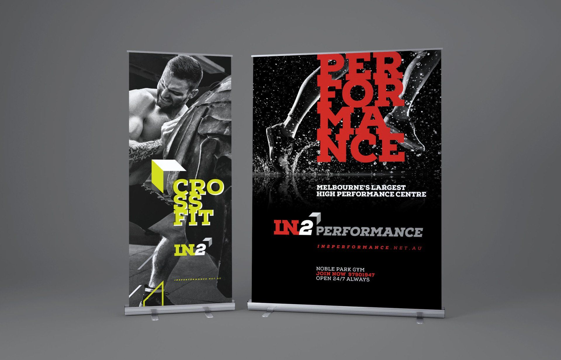
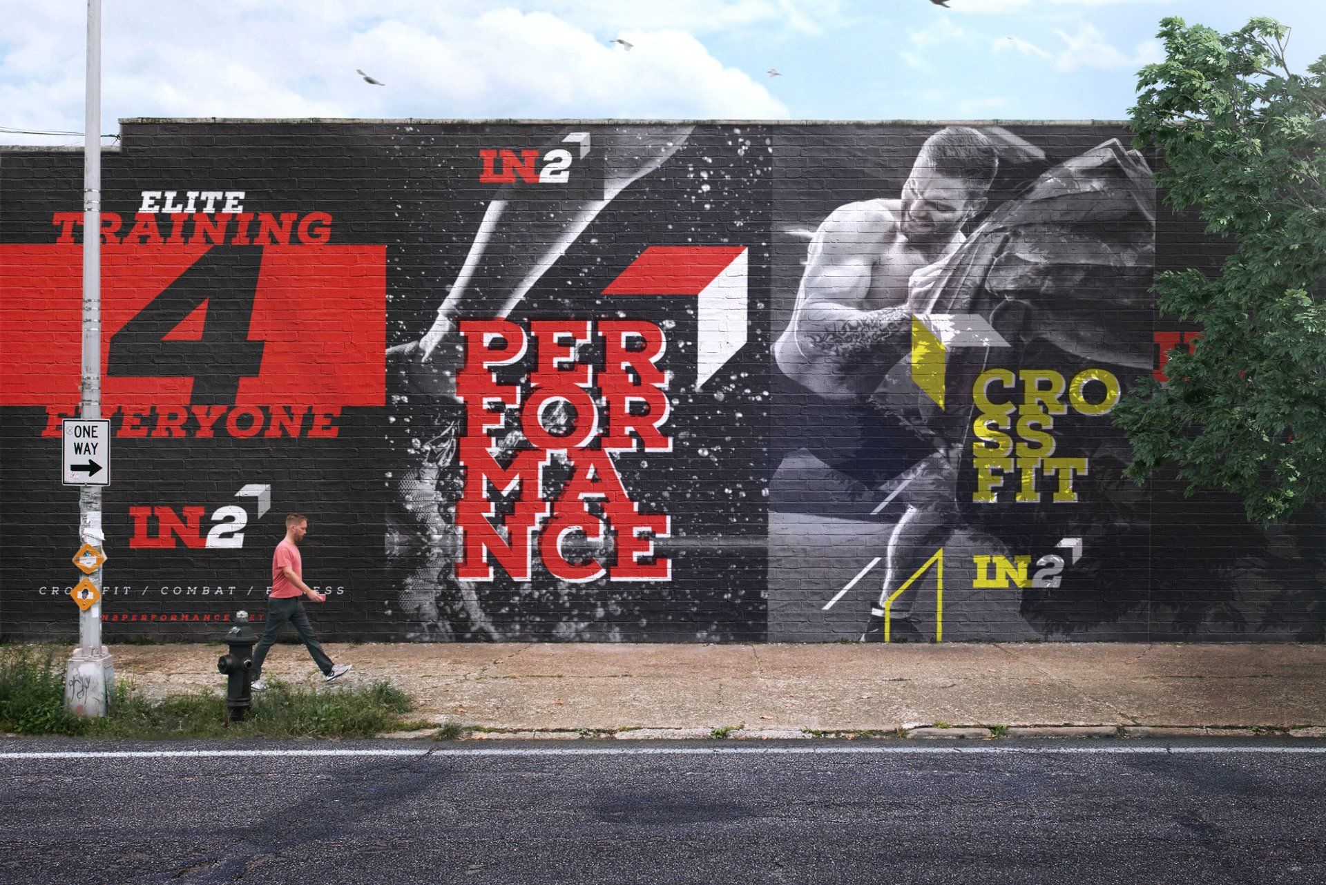
In2 Performance is one of the largest high-performance gyms in Melbourne's south-east. They aim to provide elite training methods to people with all abilities to help them achieve amazing results.
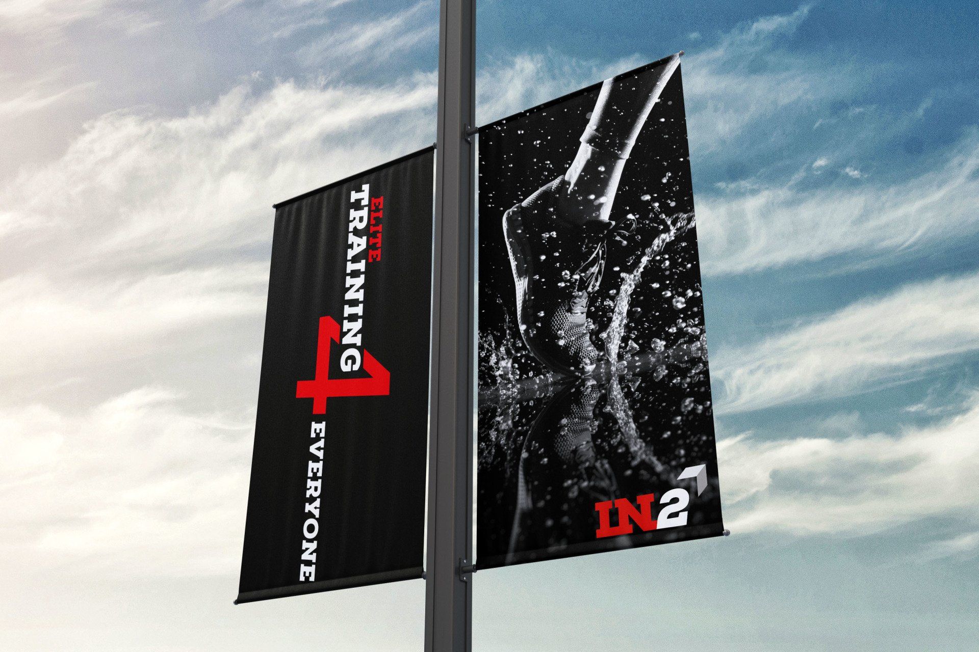
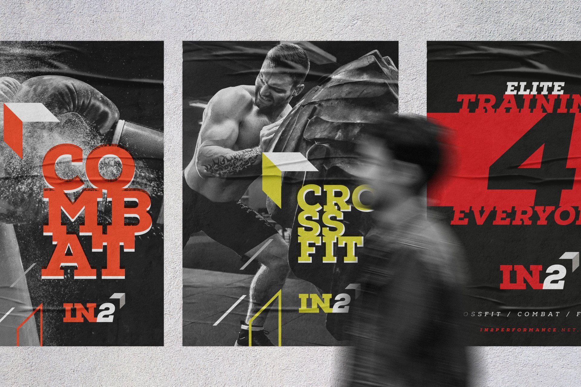
Our vision for the brand is shown below with applications that look to engage and impact visually. We were able to visualise this vision by designing membership cards, apparel, environmental graphics and posters that would appear throughout the centre and mobile billboards for their vehicle livery.
01 /
Brand Identity
02 /
Branding
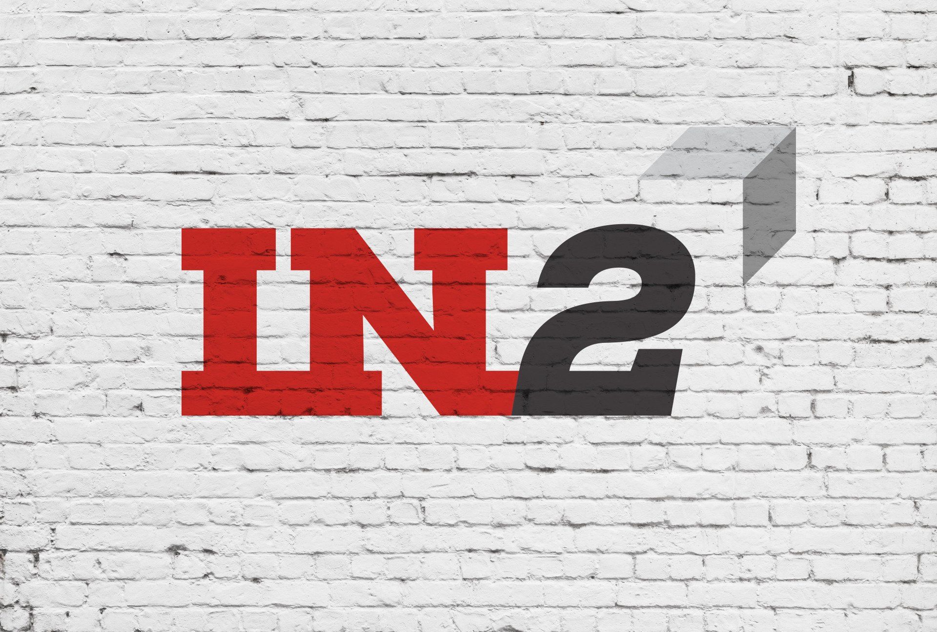
Brand Vision
We refined the original colour palette and used a bold typeface to create a strong wordmark. The logotype allows flexibility by changing the multiple services without losing the overall brand attributes.
We used high contrast black and white photography to highlight the energy and power of the brand.

// Get in touch
Melbourne / Australia / Branding / Logos / Publications / Advertising / Signage / Packaging / Digital / Web