Queensland Cyber Infrastructure Foundation (QCIF)
Rebrand & Website Launch
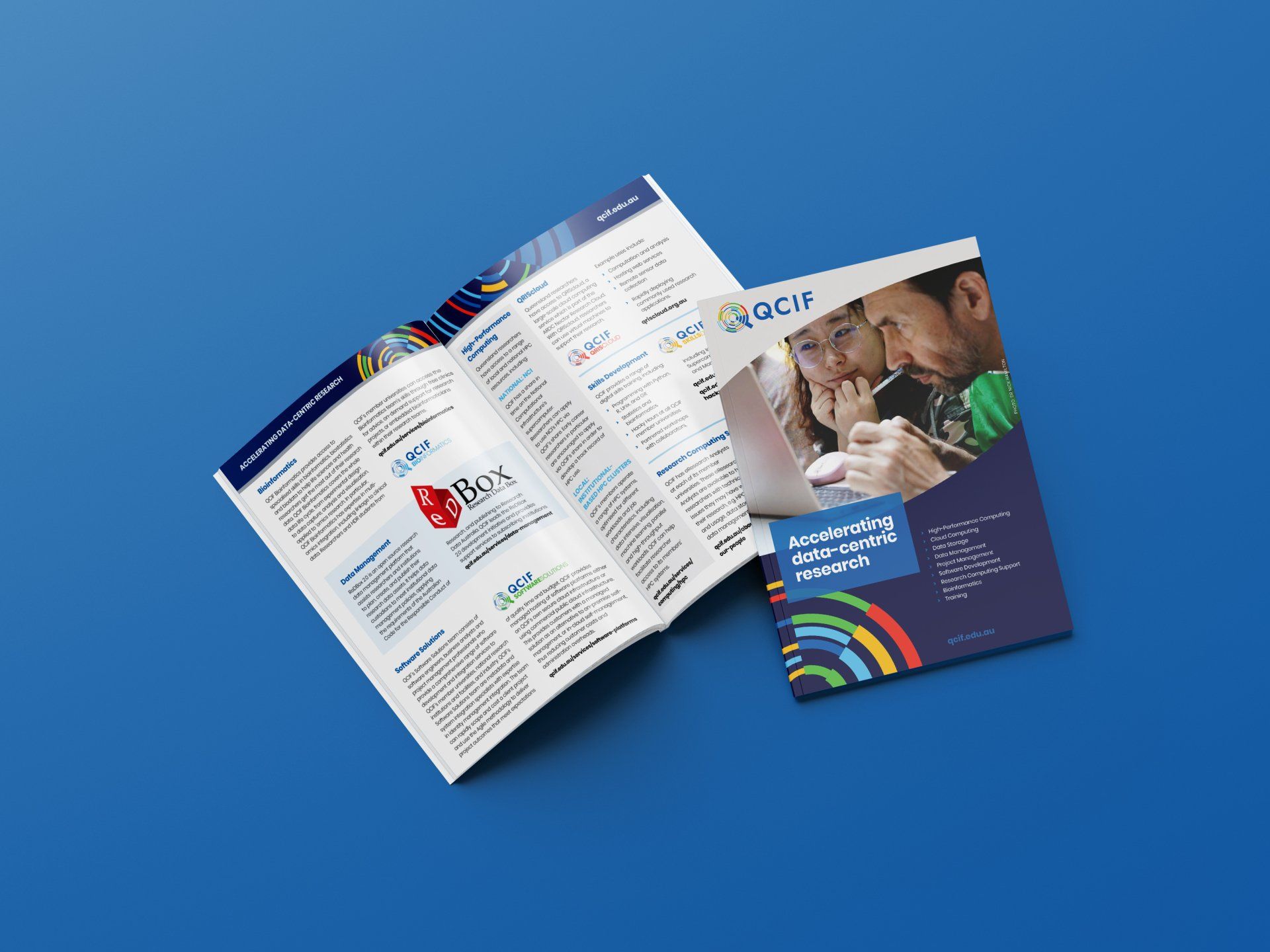
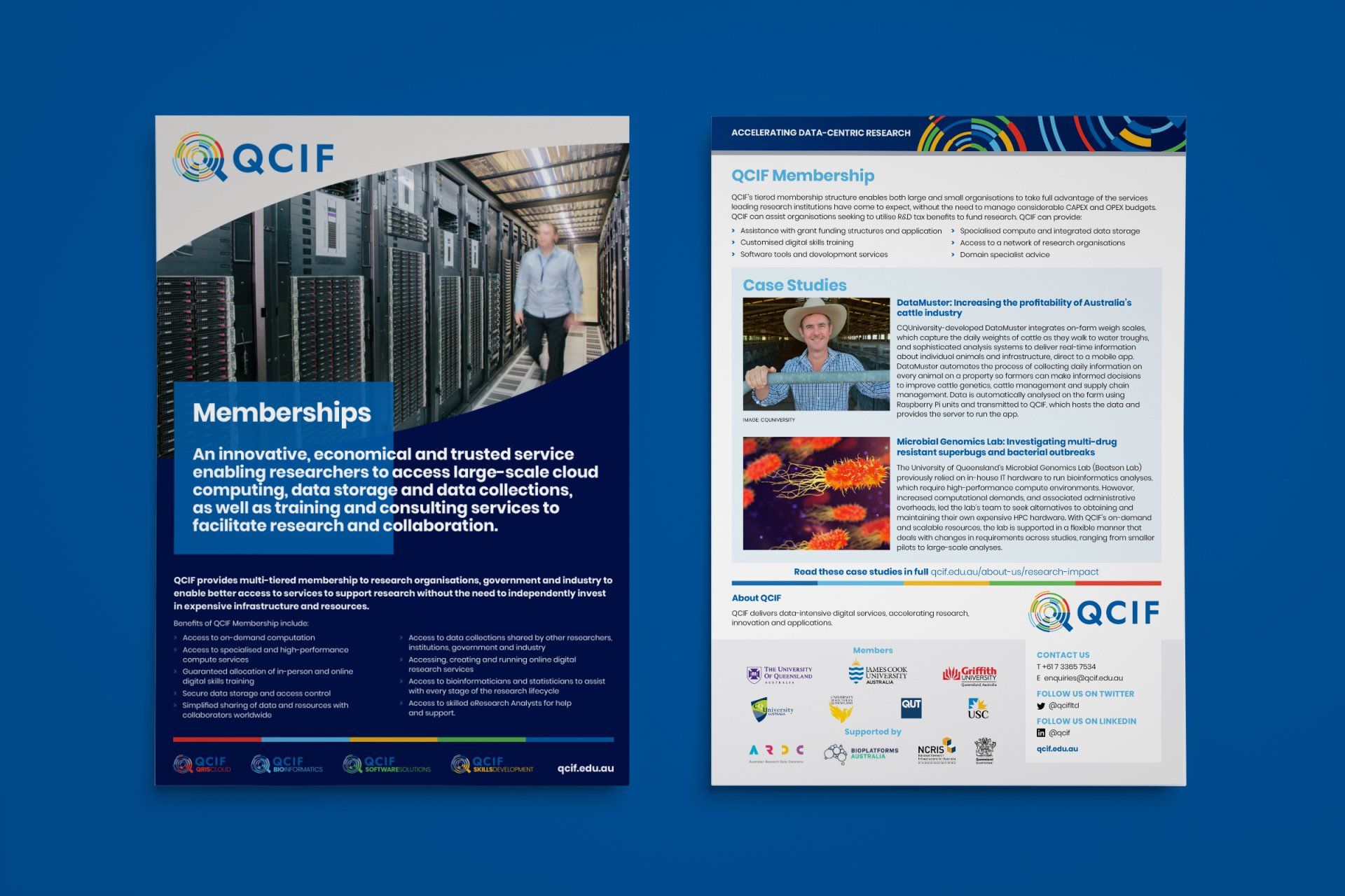
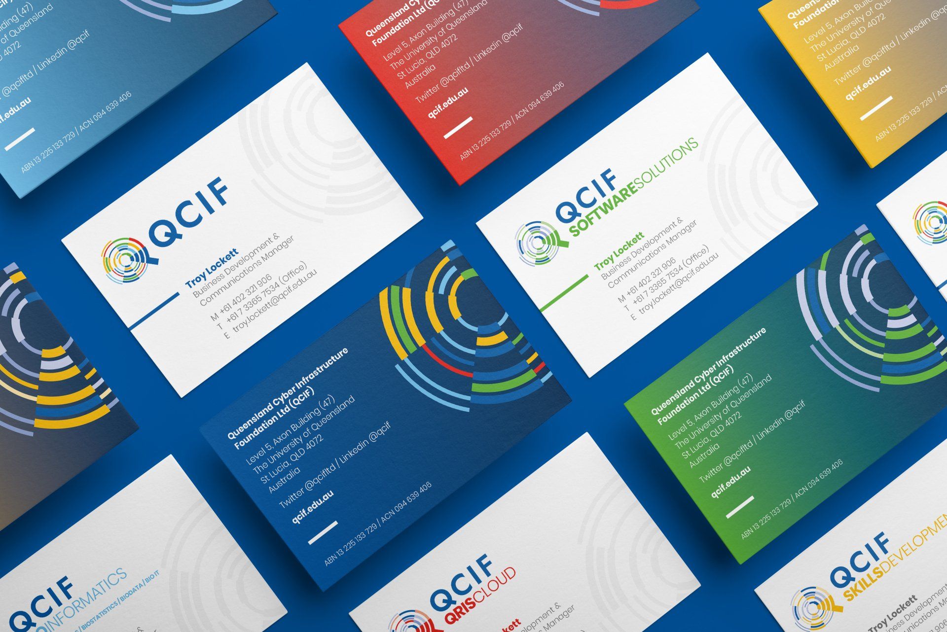
- Brand Identity
- Collateral for Print & Digital
- Website Design
Queensland Cyber Infrastructure Foundation (QCIF), a provider of high-performance services and infrastructure for computational and data-driven collaborative research, underwent structural changes and service enhancements. To engage its audience, QCIF rebranded its logo, which was originally a map-based design.
My goal was to create a modern, versatile logo symbolising QCIF’s data-centric approach, adaptable across platforms. I applied my “bringing to life” design philosophy, focussing on the letter “Q” as a stylised magnifying glass or search icon. Different colours and line thicknesses represented diverse data types, and dynamic revolving concentric circles added dimension and flexibility.
I also realigned all QCIF sub-brands under the primary brand, defining each with distinct colours, fonts, and structural elements. This ensured cohesion while allowing for individual identities.
The rebranded logo met all design criteria, proving adaptable for animation and 3D applications. The versatile ‘Q’ graphic could be deconstructed and cropped for dynamic layouts, supported by a robust colour palette and font family.
By implementing the new design system, QCIF quickly established brand recognition and audience engagement.
Due to QCIF's structure and services changes, we sought to rebrand and bring our logo and marketing collateral into the 21st Century. We've worked with Taso for more than five years and have always been impressed with his service, design concepts and professionalism. We trust his work and ability to meet deadlines. We now have a new logo we can be proud of and a suite of attractive and informative marketing collateral that will undoubtedly strengthen our stakeholder engagement.
Shannon Lindsay
Senior Communications Officer
Research Computing Centre (RCC) and QCIF at The University of Queensland